
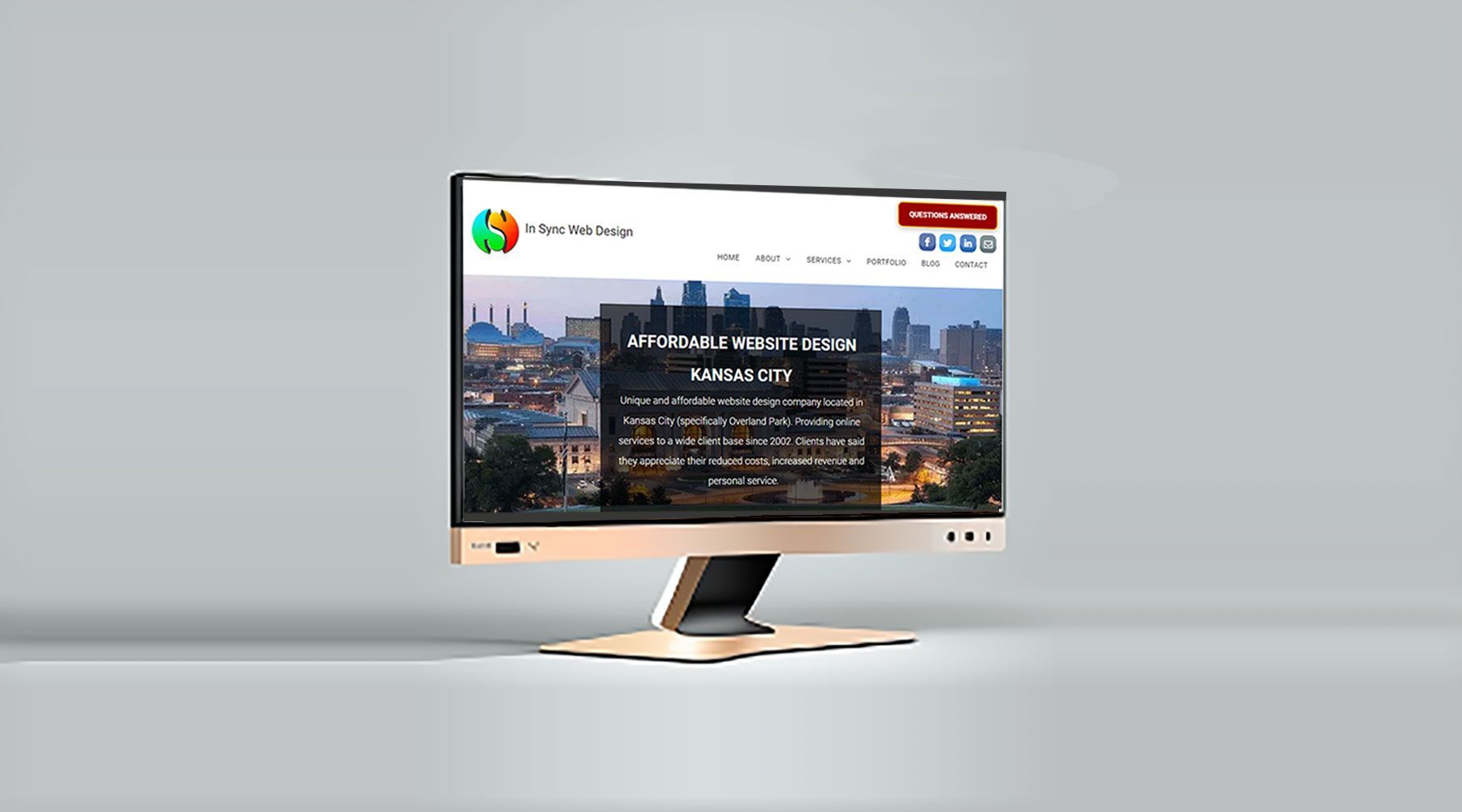
Your Website Design Looks Good on Any Mobile Device
MOBILE WEBSITE DESIGN

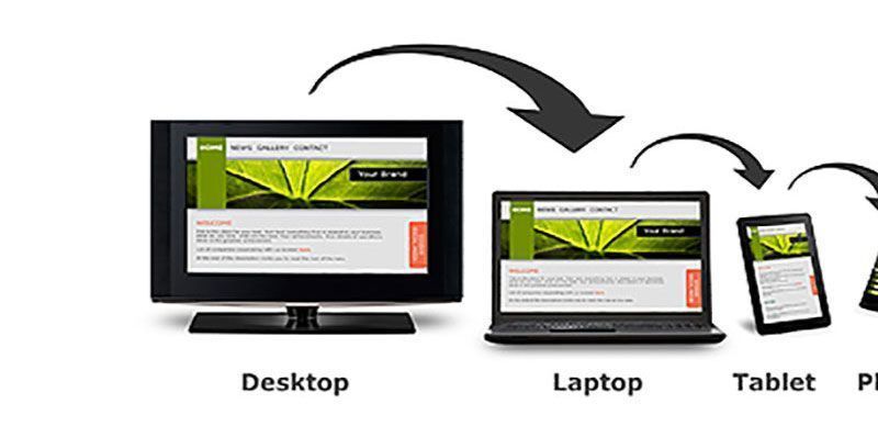
Effective Mobile Website Design
Effective mobile website design (responsive website design) needs to make your web site look visually consistent on different size screens and function easily to complete a given task. Your goal is to get as many conversions as possible. A conversion occurs when a customer completes a task (i.e., calls you, buys a product or submits a sign-up form).
It is especially important that your most common mobile tasks are optimized. This optimization is especially critical if you sell products with a shopping cart. It is vital to make the checkout process fast, effortless and trouble-free for your customers.
80% of people delete an email if it doesn’t look good on their mobile device.
The expectations of mobile users are vastly different from those using a PC or laptop. You must give serious thought to mobile website design to get the best mobile traffic results. If you fail to have a well-designed mobile site, you will reduce your chances of doing business with mobile users. When they do find you, they will soon abandon the site because of frustration having to scroll left and right to see the whole page.
98.3% of Facebook users access the platform on mobile devices. (Statista 2021)
Good
Search Engine Optimization
(SEO) calls for sites to be mobile friendly (responsive) to achieve good results on the search engine results pages (SERPs). This algorithm change was made by Google in April 2015 and was called Mobilegeddon. Sites that are not mobile friendly are penalized
and those that have chosen a
mobile website design
are rewarded in the search results.
Mobile use for searching and browsing is becoming more popular than the traditional PC or laptop searching or browsing. As a result, it is important to have a good mobile website design.
Mobile web traffic accounts for 54.8% of global web traffic.
(Oberlo 2021)
(Oberlo 2021)
How to tell if a website has a mobile design
To ensure you have the correct mobile website design, Google offers a Mobile Friendly Test https://search.google.com/test/mobile-friendly
that will analyze your site and let you know if it makes the grade or not. You want to consider the following aspects from a customer’s point of view:
- Does it load fast (less than three seconds)?
- Is navigation easy?
- Is it easy to read?
- If you were browsing, would you stay on the site?
- Is the overall experience good?
- Do the important features stand out?
If your answer 'no' to any of these quesitons, then urgent action should be taken.
"93% of Twitter video views are on mobile."
(Twitter 2021)
(Twitter 2021)
Why have a mobile website design?
- Mobile traffic is growing at an alarming rate.
- Improve search results and increase traffic to your website
- Create a better user experience
- Enhance your company and brand identity
- Increase lead generation
- Reduce your bounce rate
Just to clarify the last point, if your website is not optimized for mobile use, it will create a poor user experience and you will have a high bounce rate -- people viewing the site become frustrated and leave quickly.
When this happens, prospective customers are likely to go to a competitor that has a better optimized mobile website and spend their money there. Therefore, you are throwing away potential income.
76% of mobile users search for local businesses.
(Think with Google 2021)
(Think with Google 2021)
What makes a website mobile friendly?
Mobile users want a site that is easy to view and navigate on a mobile device. But, their main expectation is speed. As many as 40 percent of mobile users will abandon a site that takes more than three seconds to load.
In order for a site to be mobile friendly, it must have the following attributes:
- Speed – fast download time
- Ease of navigation on a mobile device
- Easy-to-read text with large fonts
- Touch-friendly design
Creating a mobile-friendly site
There are two ways to tackle mobile website design:
- Create a site that uses responsive website design to adapt to any screen size.
- Choose to build a secondary site for mobile use in addition to their desktop web site.
Wherever possible, the first option is easier to manage, maintain and control.
Final thoughts
A great website is essential to your business’ future success. As more people are using mobile devices to browse the Internet and make purchases, the importance of a mobile-friendly site will increase exponentially.
Those companies that have created and optimized their mobile website design correctly will have a strong competitive advantage. Those who don’t, will lose sales. Please give me a call
or send an email
for a mobile website design quote TODAY!!


Having a website for your business is crucial in establishing credibility and trust. This helps build a relationship with potential customers. It also provides a platform for customers to learn more about your products and service
Discover why having a mobile-friendly website is crucial for the success of your business. Learn about the benefits of responsive website design and how to implement it.